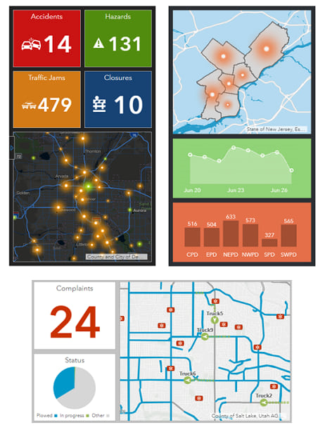
The most important thing to consider when designing a dashboard for mobile use is that you should not try to make it compete with or replace existing dashboards. Rather, a mobile dashboard should complement other dashboards, and does not need to cover all the bases. Like any other dashboard, the design of a mobile dashboard should start with a thorough understanding of the end user:
- What is this person's role in the organization?
- In what scenarios will this mobile dashboard be used?
- What organizational goals are reached with mobile data access?
A dashboard displayed on a phone should be kept as simple as possible.
Most users will have little or no need for in-depth visualizations, and interaction between elements should be limited. The small screen size of a smartphone does not lend itself to in-depth analysis, and don't forget that the mobile user will probably not be sitting down and will not have the benefit of an input device such as a mouse to initiate dashboard interactivity. If a mobile dashboard has too many visuals, it is likely not focused enough. Consider creating another dashboard.
When it comes to mobile dashboards, less is more.

Because mobile dashboards have less real estate than their desktop counterparts, it can be challenging to create an aesthetically pleasing interface and still provide users the ability to get the answers they need at a glance. One way to do this is to use color effectively, and using contrasting background and foreground colors is one technique that can be effective. With contrasting colors, metrics and outliers will stand out more.
Many mobile dashboards are about conveying performance. To this end, indicators and gauges are often the best visualizations, as information can be consumed quickly and action can be taken immediately in response to it.
Tip:
- When showing charts, limit the use of text and grids.
- Limit or avoid visuals that contain too much information to be consumed quickly. This includes details, lists, and legends.
Best practices
General best practices for designing mobile dashboards are as follows:
- Choose a phone orientation (portrait or landscape) and design for it. Dashboard elements are designed to take up 100 percent of the display and do not realign themselves with changes in the display's aspect ratio.
- Take advantage of the fact that many desktop browsers (For example, Chrome) have built-in tools that enable you to get a close approximation of how your dashboard will look on mobile devices. When assembling your dashboard, periodically turn these tools on to get a sense of how things look, and adjust sizes, text, and colors as necessary.
- Take advantage of the fact that dashboard elements can be expanded at run time to fill the entire display.
- Use a dashboard's ability to group and stack elements to your advantage, but be conservative. You should not try to re-create a desktop dashboard for your phone by overusing these abilities. When used, stacks (tabs) should be renamed to reflect their content.
- When adding elements to the dashboard, do not add any unnecessary text such as titles and descriptions.
- Don't add a header to your dashboard unless it needs one.
- Limit the amount of text you place in each element's title and description (or omit text in these areas altogether).
- For all elements, turn off the Last Update Text option.
- For the pie chart and serial chart, turn off the Hover Text option.
Best practices for maps and legends are as follows:
- Maps should be as simple as possible. Limiting a map to one operational layer whose symbology contrasts with the background basemap is ideal. This will make the map easier to interpret and faster to draw and reduces the amount of data being downloaded to your device over what might be a slow network connection.
- Disable pop-ups on the operational layers. Tapping a single feature on a phone is difficult, and there isn't as much real estate on the phone to show an info window on top of the map as there is on your desktop.
- Consider whether a refresh interval is necessary. Many mobile dashboards will be opened and then immediately closed once the information they display has been consumed.
- When adding a map to a mobile dashboard, avoid enabling map tools such as search, layer visibility, legend, basemap switcher, and so on. They are rarely needed in mobile situations.
- Because the map used on a mobile dashboard should be simple to understand, adding a map legend element is typically unnecessary.
Best practices for interactive dashboards are as follows:
- Dashboard actions should be kept to a minimum.
- Use selectors sparingly. When you use them, consider placing them on a left panel configured to slide over the dashboard rather than on a dashboard header.